
susan kare: iconic design
museum exhibit for the mother of icon design
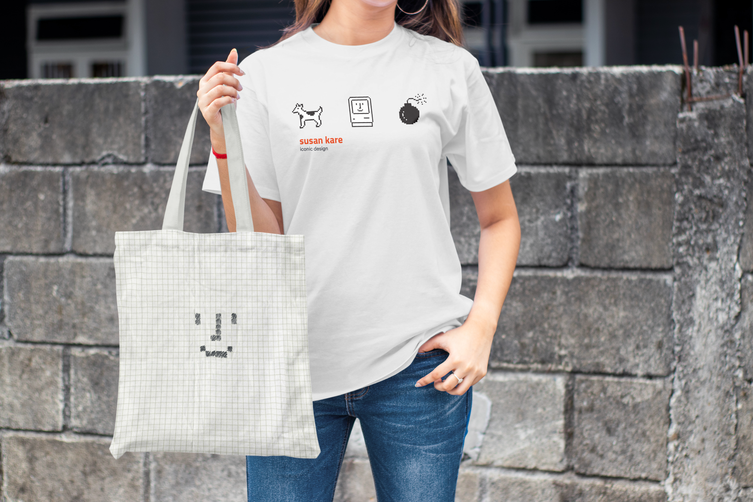
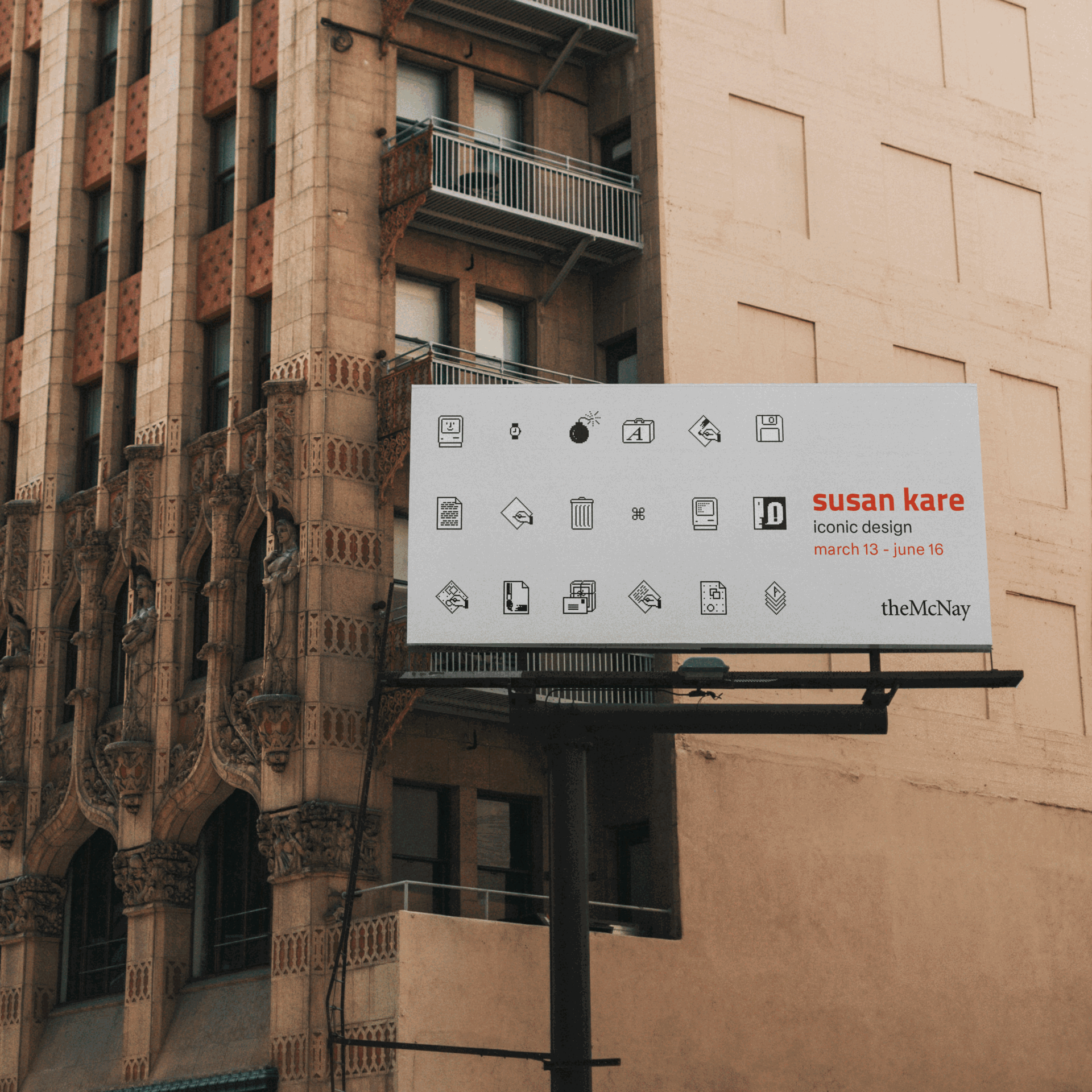
signage • apparel • layout • typography
One of my inspirations in the design world is Susan Kare - renowned graphic designer and creator of the original Apple Macintosh UI icons and typefaces. Her skill in translating imagery into the most minimal pixel art is unmatched.
The challenge here was to create an homage to Kare by creating a booklet showcasing her work so that other young women could be inspired by her and perhaps become interested in graphic design themselves. This developed into designing assets for a museum exhibit where the booklet would be distributed, which would need to be cohesive with the style used for the booklet.
discovery

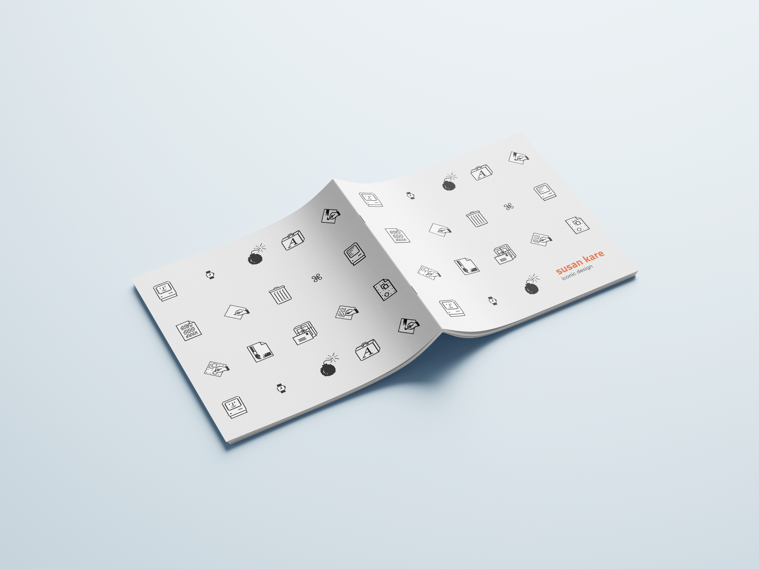
Since the exhibit is a tribute to Kare’s work, particularly her incredibly influential work for Apple, I wanted to keep things as minimal as possible just like her pixel icons. Simple, single colors and a blocky, grid feeling throughout.
sketches
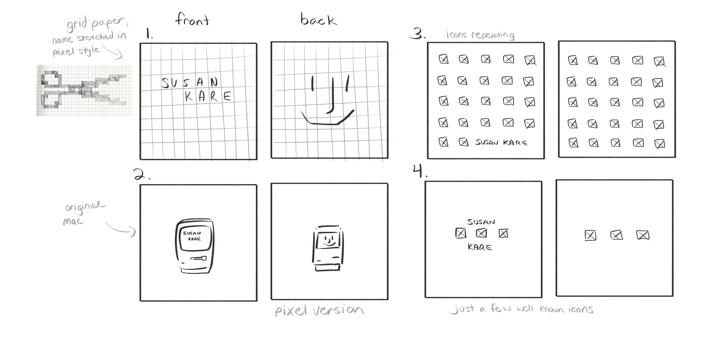
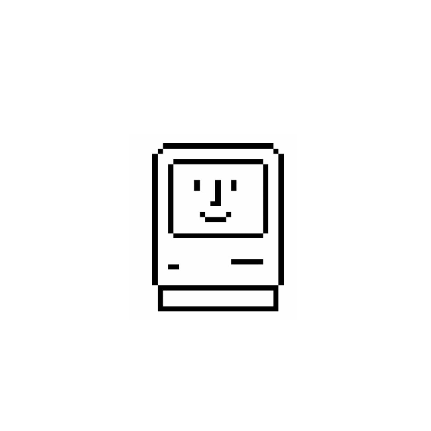
Coming up with potential covers for the booklet, I again wanted to keep things very minimal. The first option, one of my favorites, references the grid paper which she would use to sketch out her designs before moving to a computer. For the second option, I felt it would be interesting to contrast the actual original Mac computer with Kare’s pixel art version on the back so readers could compare and see how she minimalized objects. I liked the idea of creating a lot of white space in some of the designs to further emphasize the small size of Kare’s pixel icons.
digital drafts


For the drafts of my booklet covers, I added minimal color to avoid things becoming overly detailed or complex. I wanted to stick closely to my references of Kare’s work. In her prints of her pixel art, Kare often sets icons against solid color backgrounds with a red-blue-green theme, so I incorporated the same colors into my designs.
final designs
The final products keep a strong theme of minimalism, grids, and squares to keep in line with Kare’s style when working for Apple.


reflection
I’m a huge fan of minimalism and pixel art, so getting to pay tribute to a master was delightful. I’m really happy with how I was able to keep everything cohesive and even had the opportunity to incorporate elements of my other cover drafts into the rest of the touchpoints.