
citrine
high-end sparkling juice
logo • branding • social media • packaging
Citrine sparkling juice is a brand made for entertainers - the 30-something dinner party fiends of the world who have money to burn and a love for the finer things in life. The name “Citrine” comes from the gemstone, which is often associated with prosperity and success - fitting for the target audience.
The challenge here was to create a logo and branding that appeals to this audience while standing out from the competition with a unique personality.
discovery

The initial moodboard for this project consisted of a light, minimal aesthetic leaning toward feminine. I wanted to use a mix of pastel colors and modern typefaces common in today’s designs. I felt inspired by minimalistic, lightly colored packaging I saw in other drink brands and wanted to go in a similar direction.
sketches


I explored a variety of options for the logo and specifically concentrated on playing with the C to create various shapes that could evoke the meaning of the name or relate it to the drink. I also began experimenting with different label designs and ways I could utilize the gemstone shapes to create interesting patterns and visuals that could be varied across multiple flavors.
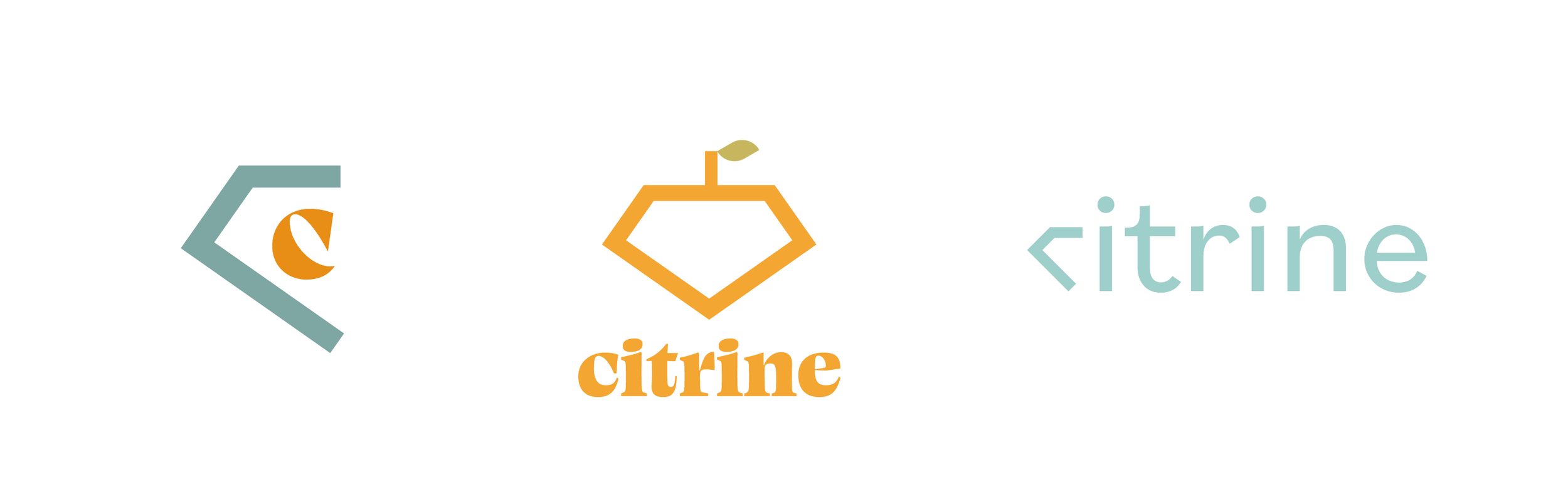
digital drafts
After narrowing down my logo concepts, I ended up going with the third option as I felt the simplicity and subtlety of the diamond shape when next to the rest of the word added to the luxury and elegance of the brand. The clean minimalism of this logo also helps it feel more modern.


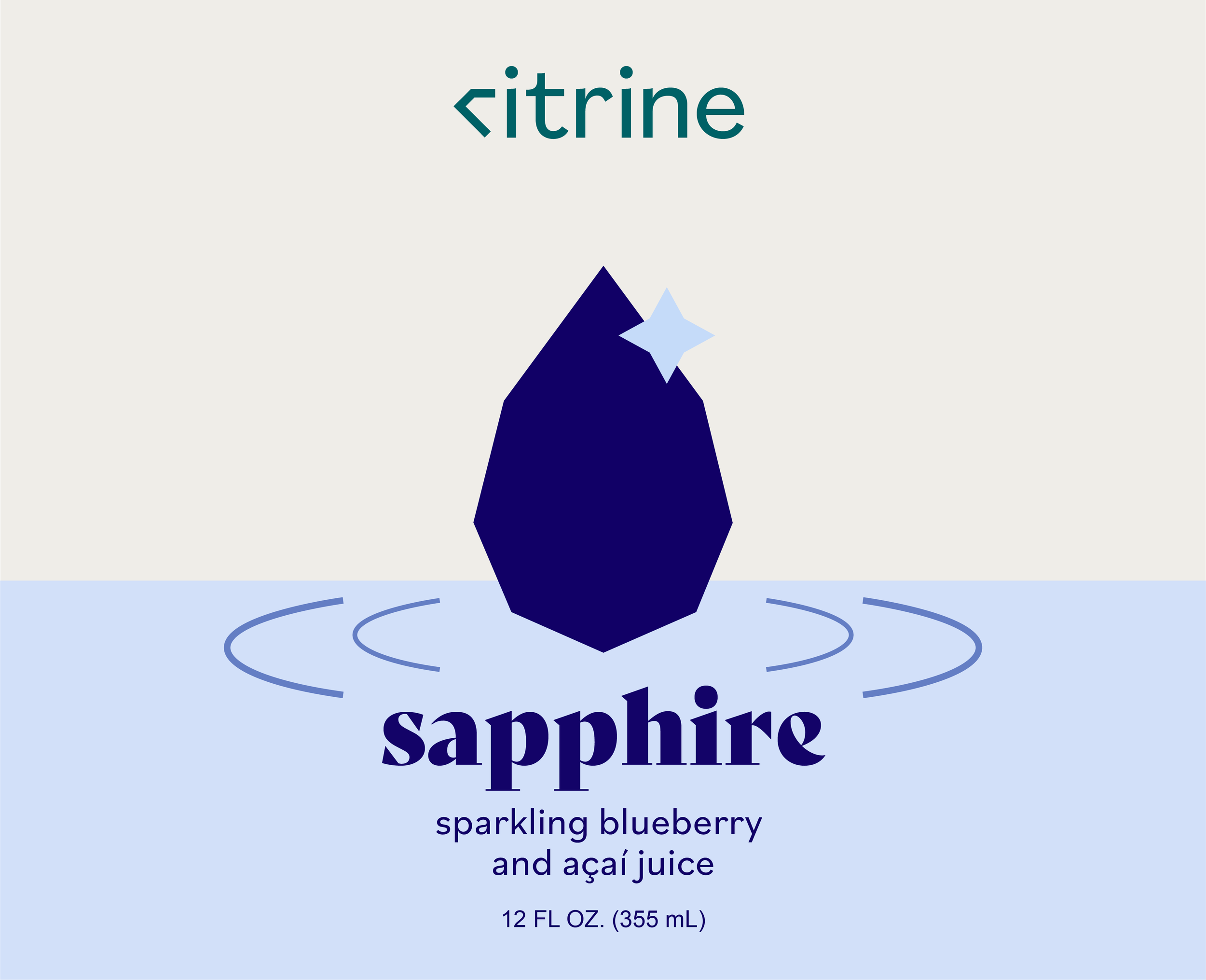
For the packaging, I created two digital drafts for labels. For the top option, I wanted to create movement across the label as you turned the bottle with a teardrop gem pattern. With the second, I emphasized the connection between the gems and the product itself by creating a fluid themed design, creating movement on the back with the splash of gems dropping into the juice.
second round
With this round, I added another flavor to the brand to show how various elements would change across packaging to signify this. I wanted each flavor to have a distinct gemstone shape and color that would be easily recognizable and memorable.
I played around with having a slogan follow the wave of the juice on the back to break up the gem illustrations, and I changed the colors to more muted pastels with darker gems to increase contrast and ensure the color palette didn’t feel too bright or cute.


third round
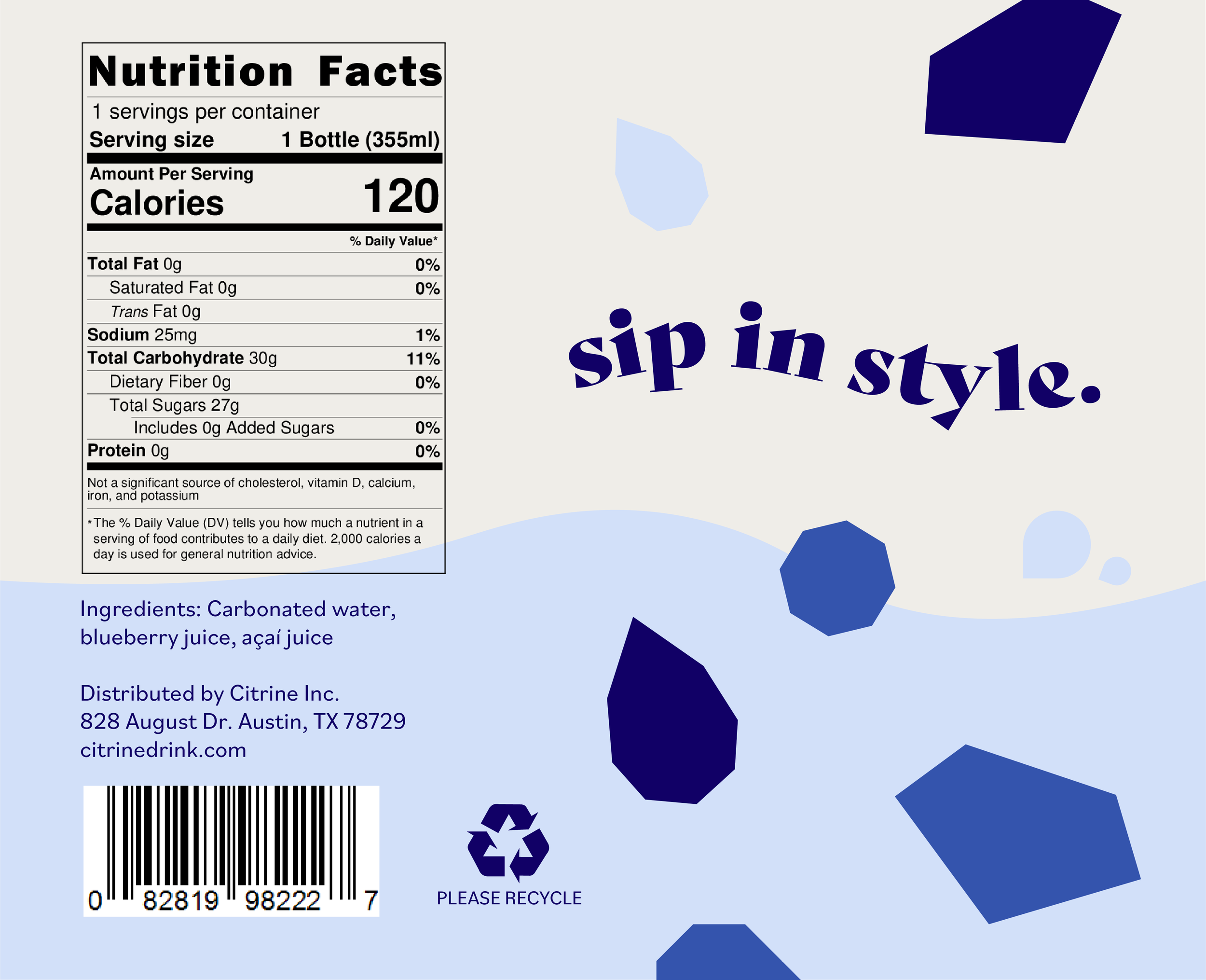
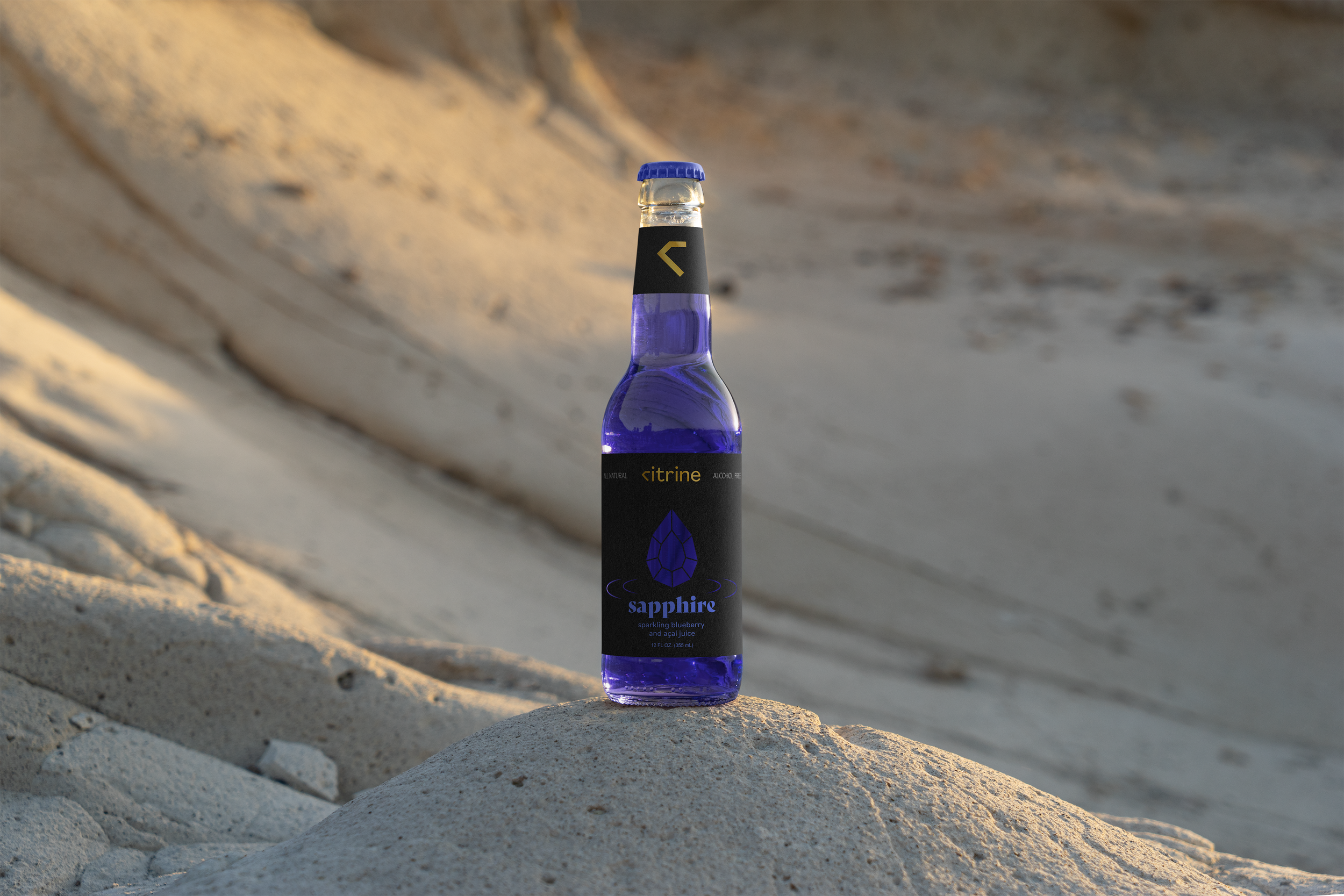
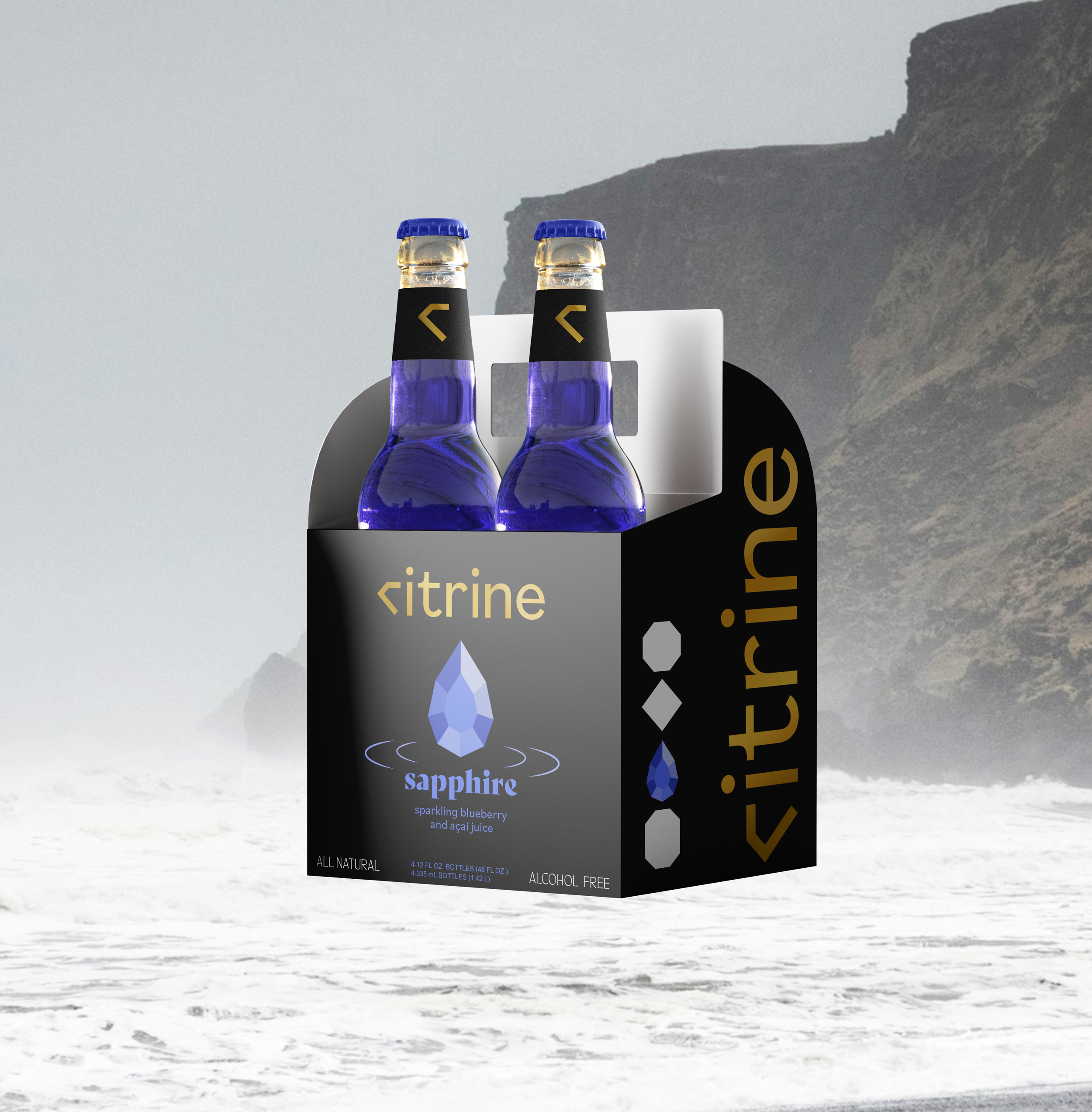
After some feedback and time away from my initial designs, I knew there were changes to be made. To evoke a more high-end aesthetic, I changed course and decided on a charcoal colored label with a gold logo. The dark background helps all of the elements pop with much stronger contrast, and the combination of gold and black creates a much more luxurious feeling.
I also gave the gems more detail by including facets, and I decided to make the gems and ripple effects transparent to allow the juice’s color to shine through and create a more realistic gem-like look using the glass of the bottle. In addition to having a different gemstone cut, each flavor also has a different cutout pattern on the back of the label to add variety.
Lastly, I made sure to add “All Natural” and “Alcohol-Free” to the labels since these are selling points I wanted to make sure were featured.
final designs
Alongside my new labels, I created a design for a 4-pack of bottles as well as an Instagram feed showcasing the personality and aesthetic of the brand - a sort of unusual, other-worldly feeling that really sets the brand apart from other sparkling juices.


reflection
This project was a challenge because I ended up pivoting so far from my original idea for the aesthetic, but the change was very much needed. I’m happy I let go of the original designs and reworked them, because I couldn’t be happier with the new look!