sugar drop
diabetic accessories company
logo • branding • style guide • stationery • apparel
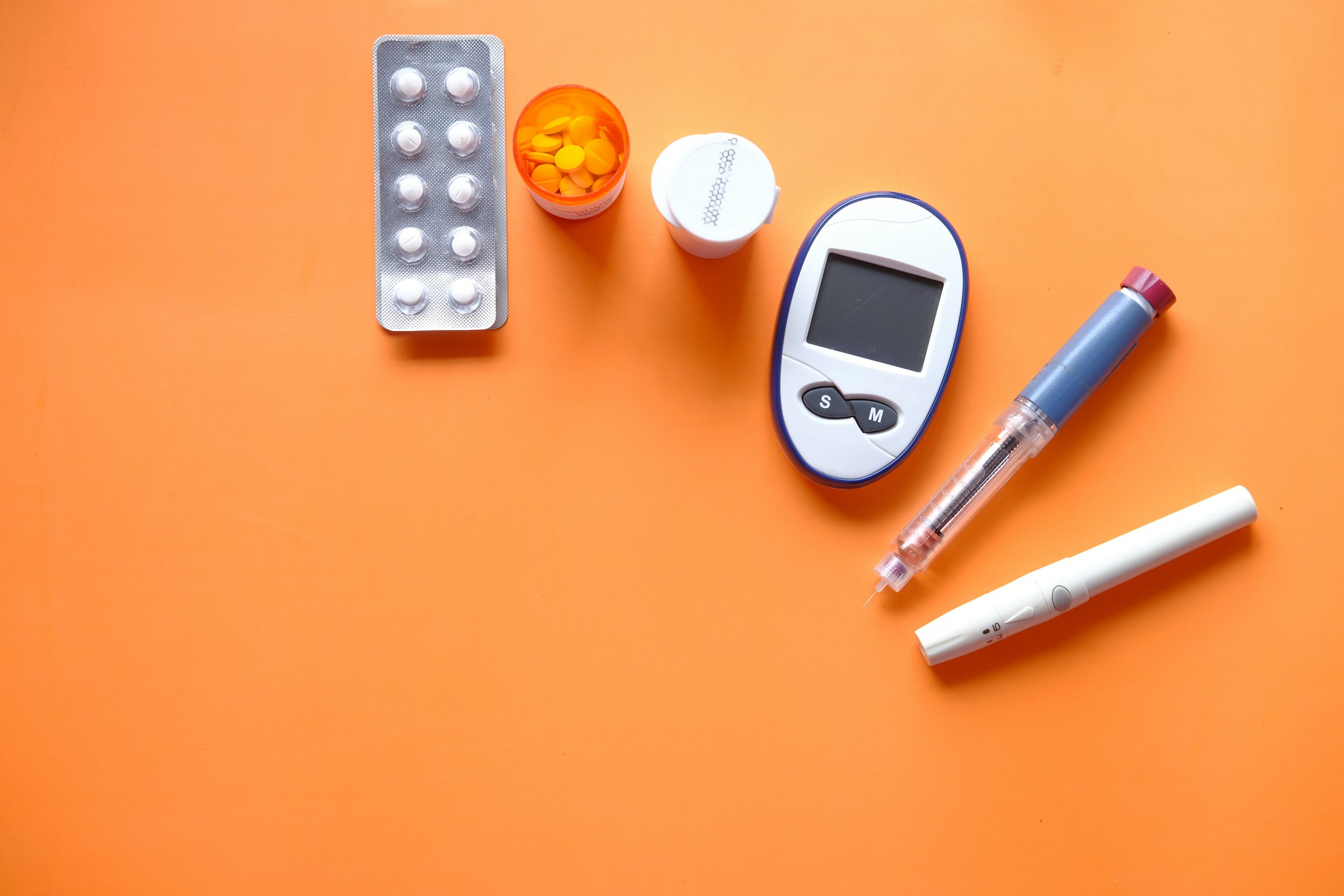
Sugar Drop is a company relating to something very personal to me - diabetes. I have been a type 1 diabetic since I was almost 2 years old, and I use an insulin pump and constant glucose monitor. Having these devices in my life for so long, I'm well aware that very few appealing accessories such as cases and skins exist for them. This is unfortunate because like me, many are diagnosed with type 1 at a young age, and making these intimidating-looking devices appear more personalized and fun would greatly benefit young people.
The challenge here was to tackle this issue - create branding and touchpoints for a diabetic accessories company with a bright, kid-friendly, cheerful attitude in order to help decrease the fear and stress surrounding medical care for children.
discovery

With a recent resurgence of Y2K aesthetics, I knew I wanted to create a brand with a thick, playful typeface and vibrant color palette inspired by 2000s teen-centric fashion stores such as Claire's and Limited Too. I focused on finding inspiration for this kind of aesthetic in my moodboard, and searched for typefaces with a bold, girly mood.
sketches

In my sketches, I explored various concepts such as candy shapes, usage of arrows and teardrop shapes, and the incorporation of a sugar cube.
digital drafts

I played with a few options digitally, specifically utilizing the double meaning of drop in reference to a drop of blood needed to test blood sugar levels, and dropping sugar cubes.
second round


In this round, I explored a different color palette for two of the options as I wanted to stay away from pink and move to more neutral colors that could be appealing to more children. Since the brand would have a variety of design styles for their products, I didn’t want the palette to be too feminine. I played with combining typefaces in the second option to add a little contrast, and tried including the cube within the word to decrease the amount of space the logo takes up.
final designs
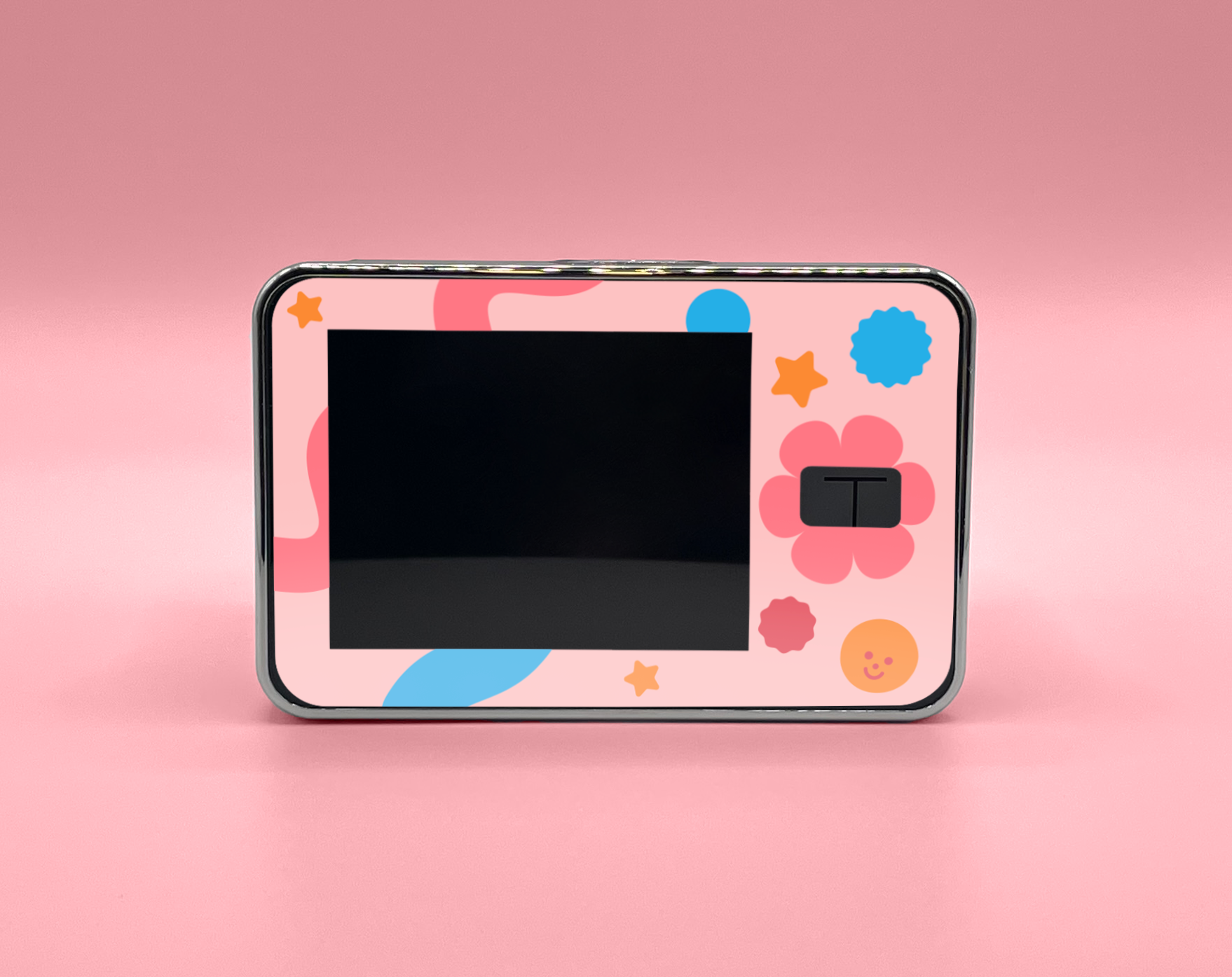
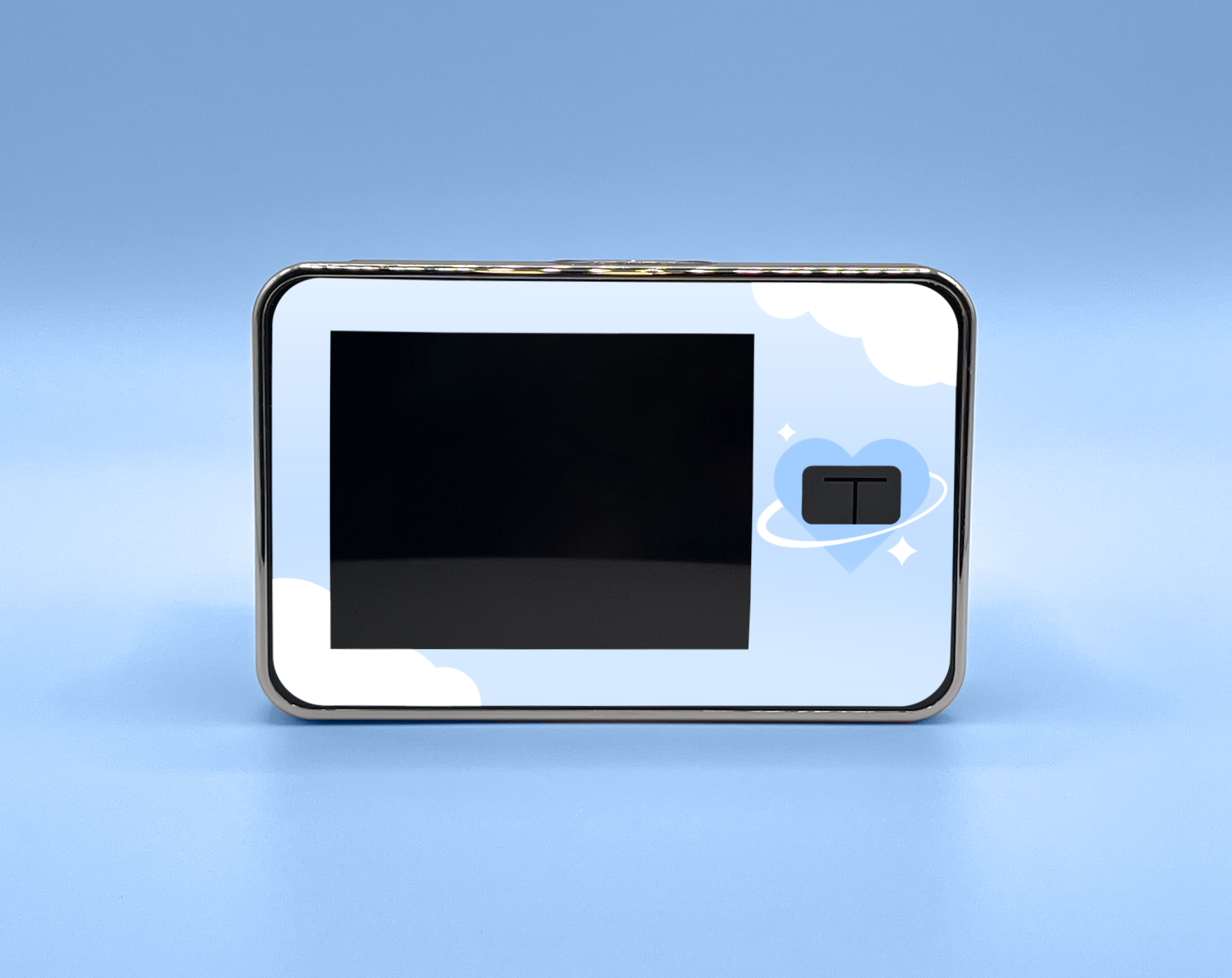
For this project, I created a logo with variations, a shopping bag, an employee t-shirt, stickers, stationery, insulin pump skin designs, and a brand style guide. The photos for the insulin pump skin designs were particularly fun to create as they were taken and edited by me using my own pump. The sugar cube shape proved to be incredibly versatile, and I was able to create a variety of designs utilizing the shape to make different patterns and visuals across the touchpoints.


A few pages from the brand style guide

A few pages from the brand style guide

A few pages from the brand style guide

A few pages from the brand style guide

A few pages from the brand style guide
reflection
This project was quite special to me because of the personal connection I had to the subject. I’ve been wanting to make something that relates to this aspect of my life for a long time, so finally getting to realize it was a wonderful experience! I definitely want to make more work involving diabetes, and I’m currently in the process of working on actual case and skin designs to further develop the project.