jenga
retro board game redesign
logo • branding • packaging • social media • signage • apparel
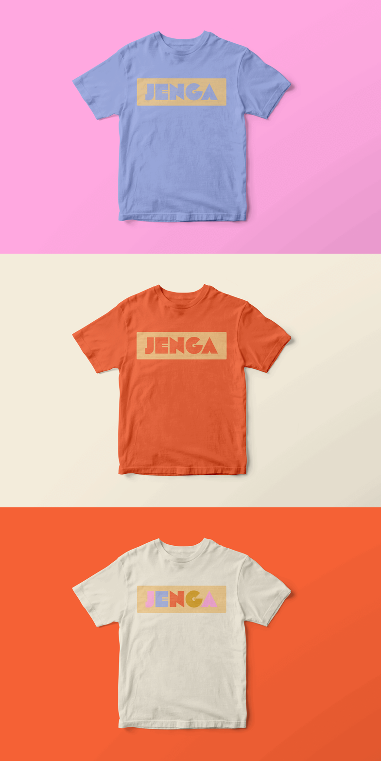
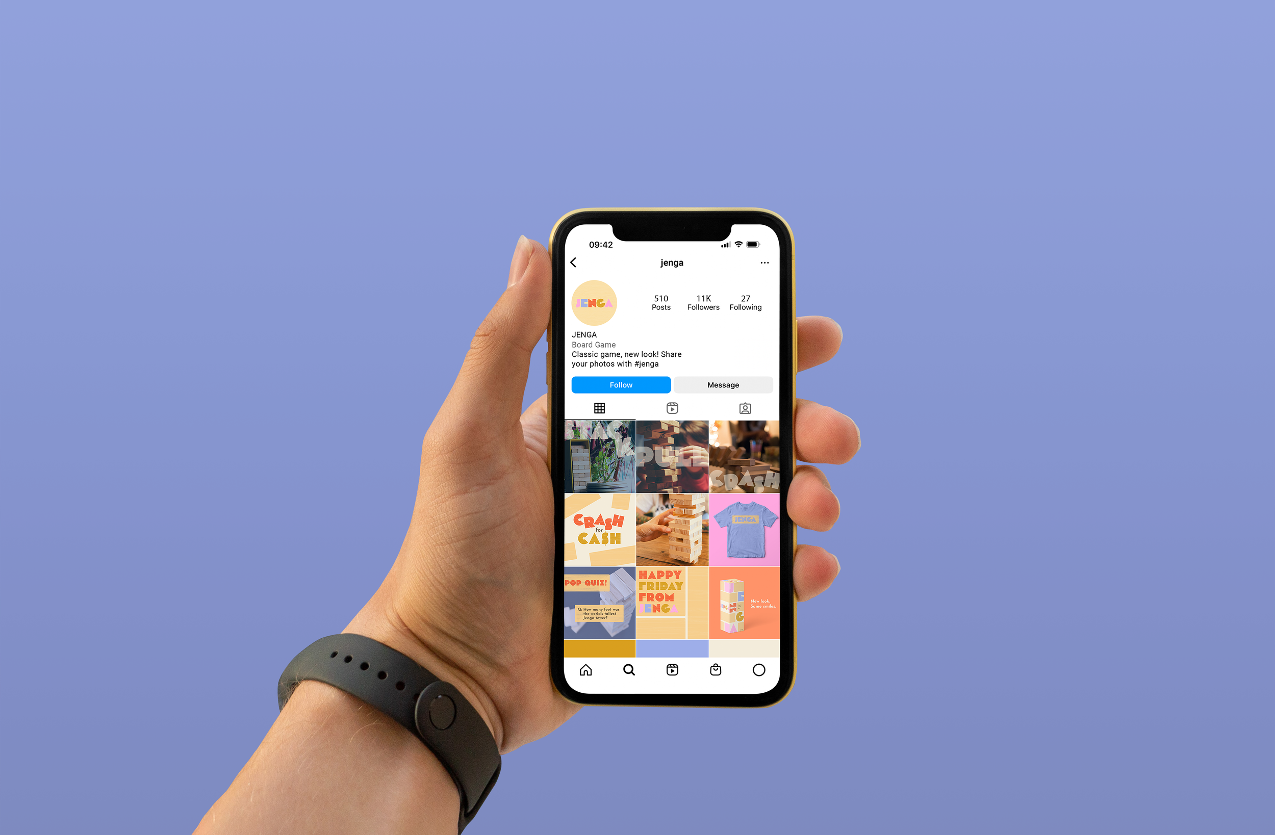
Jenga is a family-favorite game that’s been around for over 40 years, so when redesigning the brand for a modern audience, I wanted to call back to the era of its release and give it a retro-modern feel. The goal of this project was to redesign the packaging for Jenga and create new branding to revive the game for families today - getting them off of their phones and into more quality time together.
discovery
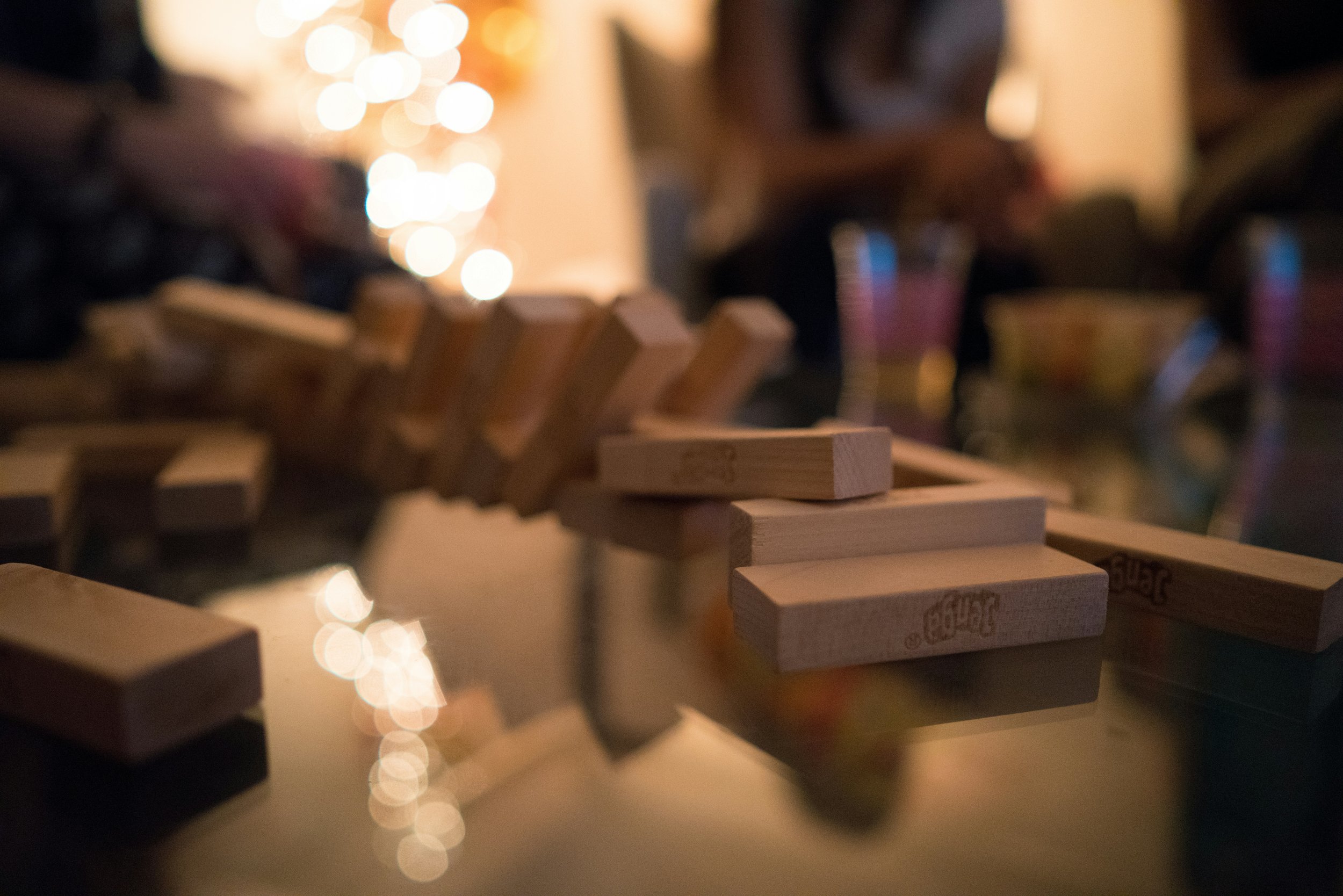
Jenga’s current design, shown on the left, is bright, loud, a bit cluttered, and uses photography, so in order to create something new and refreshing, I wanted to avoid showing actual photos of bricks on my packaging and stick to colors that are a bit softer with a more minimal approach.
In my discovery phase, I looked for images with text and colors that reminded me of a late 70s to early 80s aesthetic. I looked to older board game designs for inspiration, and I found wood block textures that I knew I wanted to utilize in my design to reference the Jenga blocks themselves.
sketches
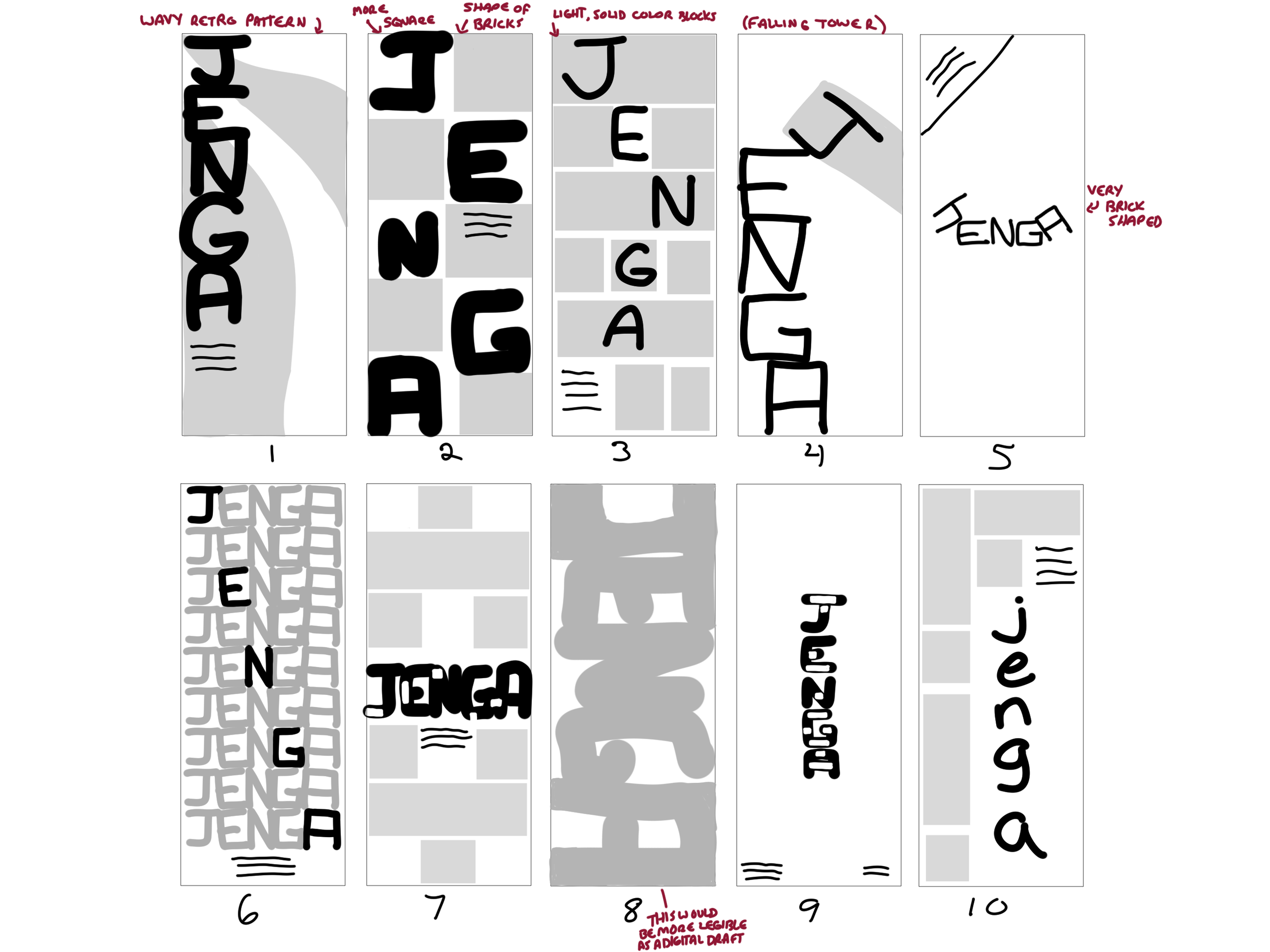
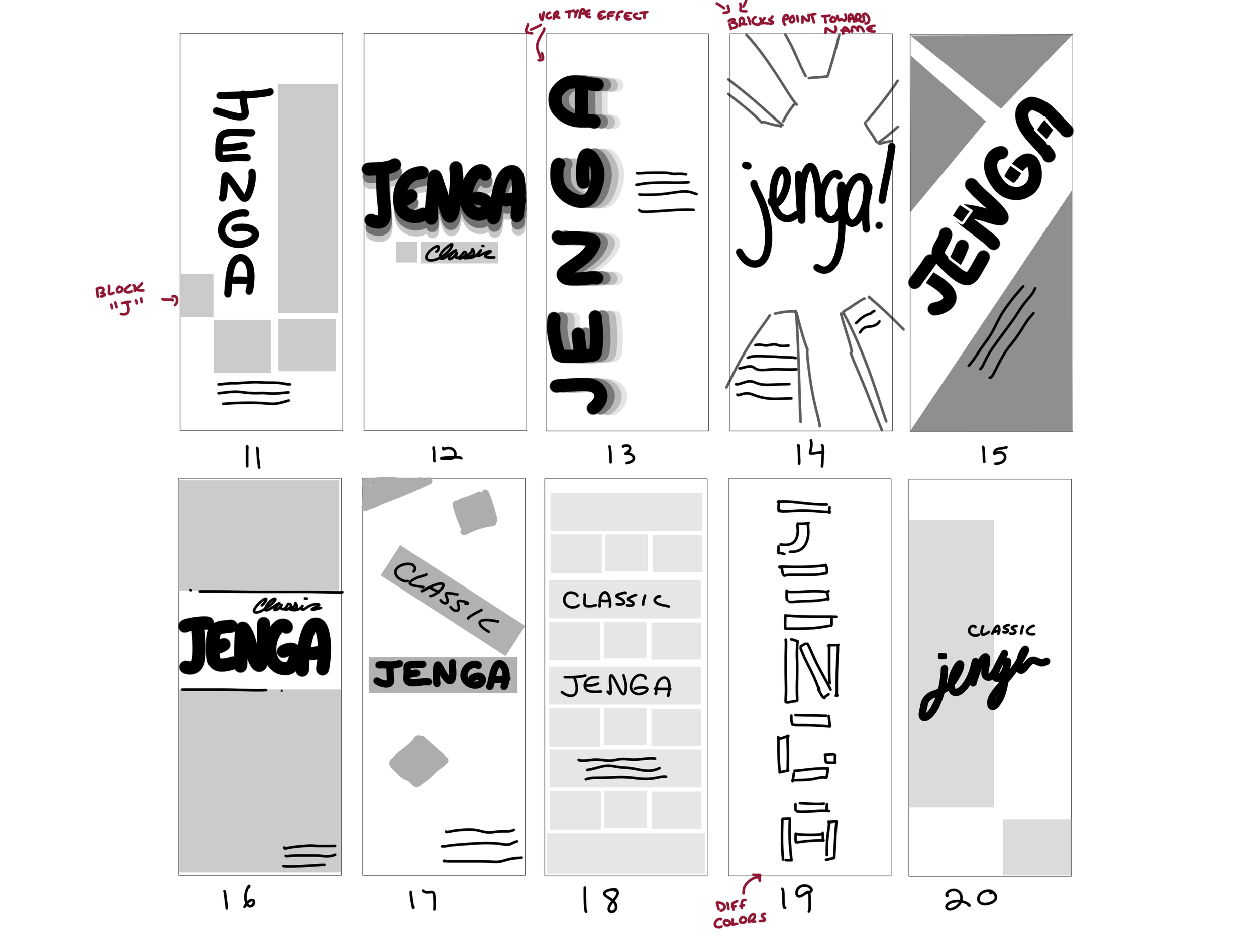
In my initial sketches, I knew I wanted to explore various ways to utilize the brick shape within the composition since it is a simple geometric shape that is easily recognizable and easy to create patterns or break up text with. I continuously referenced retro board game packaging for inspiration.
digital drafts
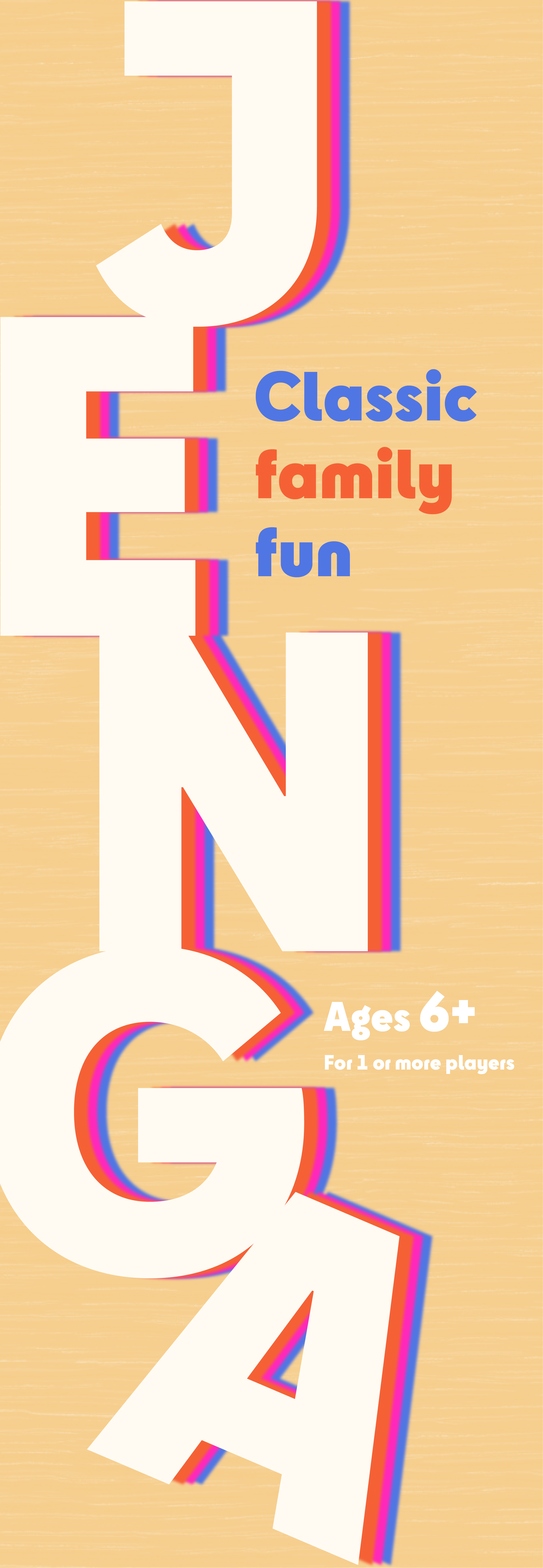
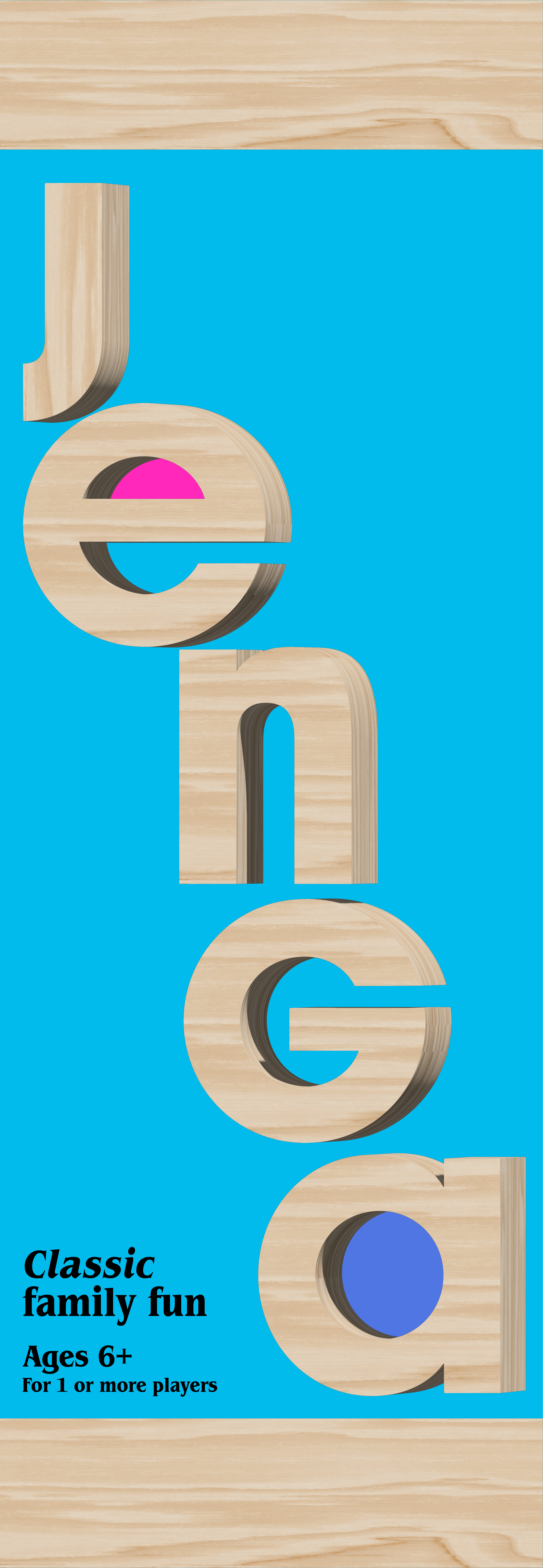
My first drafts alluded to the game by stacking the letters vertically and, in the second option’s case, creating some tension and making them feel as though they might fall over. In the third option, I experimented with making the logo text 3D to further push the connection to Jenga bricks. The way the 3D is rendered and shaded in Illustrator almost felt a bit primitive to me, so it further ties into the retro aesthetic by looking like early 3D graphics.
In the end, I moved forward with the first option, which referenced tightly stacked Jenga bricks fitting together in a tower, guiding your eye down the packaging with alternating letters and colors.
second round
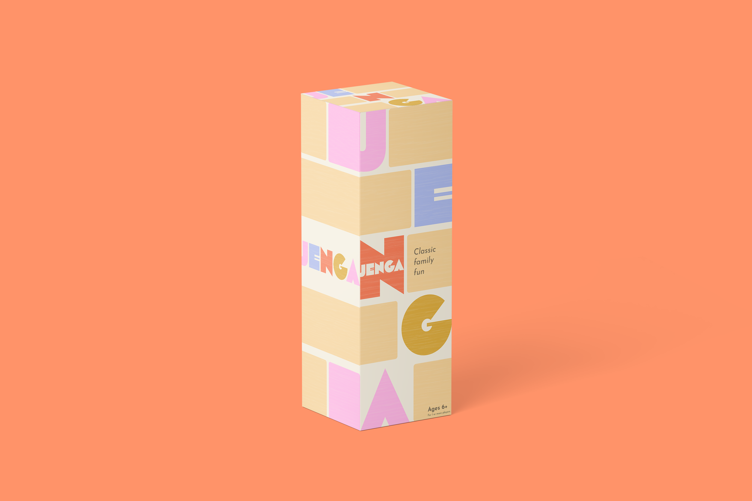
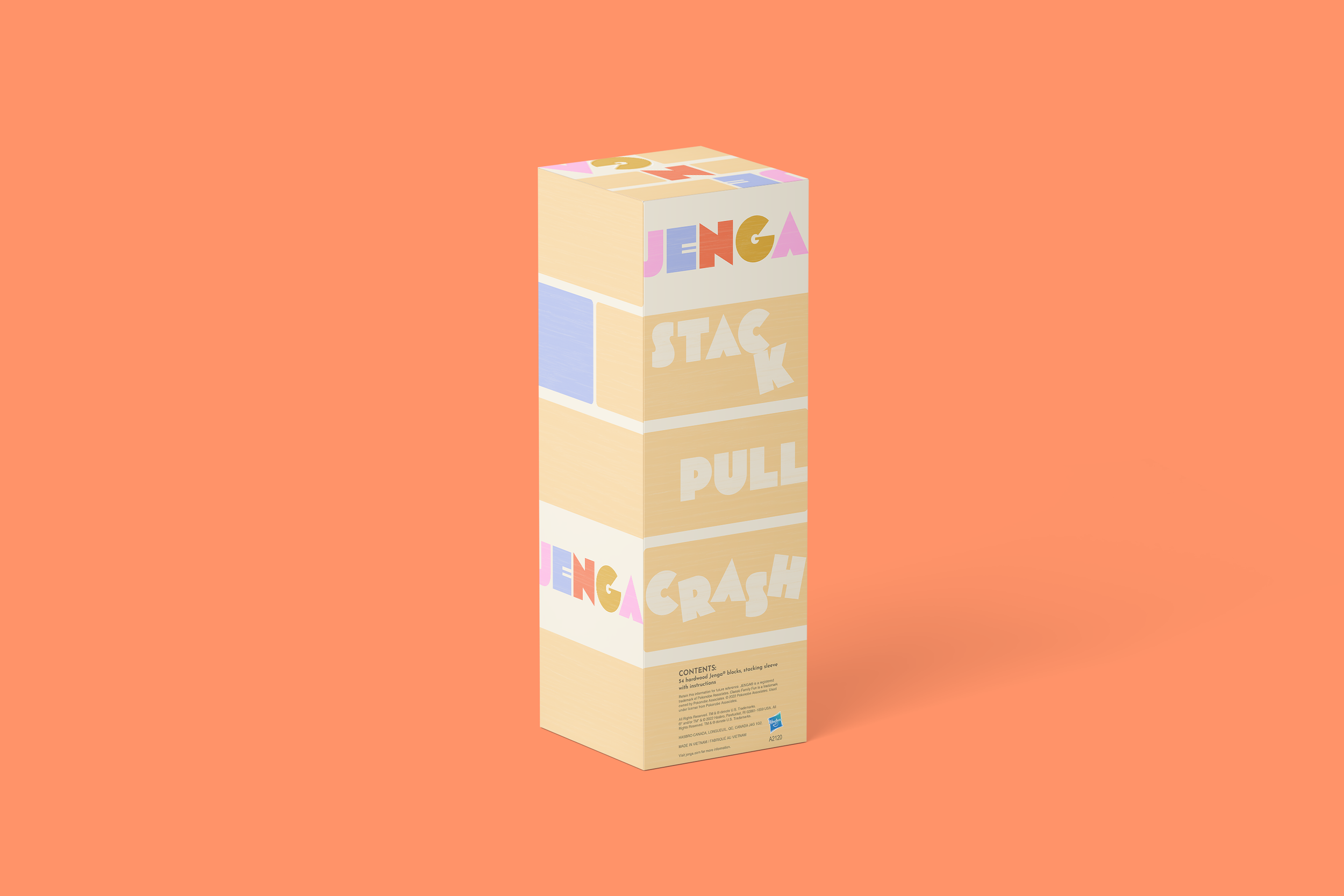
Building each side of the box, I wanted to continue utilizing the bricks as a design element and played with stacking them around the letters in different ways. I tried playing with scale and showing the bricks smaller on the side so that the shape of the tower would be more clear. I also made a side option similar to the front but keeping the letters wood colored to make sure the front stood out most and keep the side design more subtle.
final designs
After receiving feedback, I decided to change the sides of the box to keep the brick size consistent with the front and create a design where the bricks and letters wrapped around the box seamlessly. This creates a more unified feeling throughout the packaging. I also reduced the amount of space the “contents” portion took up to keep the focus on the slogan on the back of the box.

reflection
This was one of my favorite projects to work on because I adore packaging and games! The Jenga brick is also such a versatile shape to work with, coming up with ways to use it to break up my designs and block out information was so much fun!


